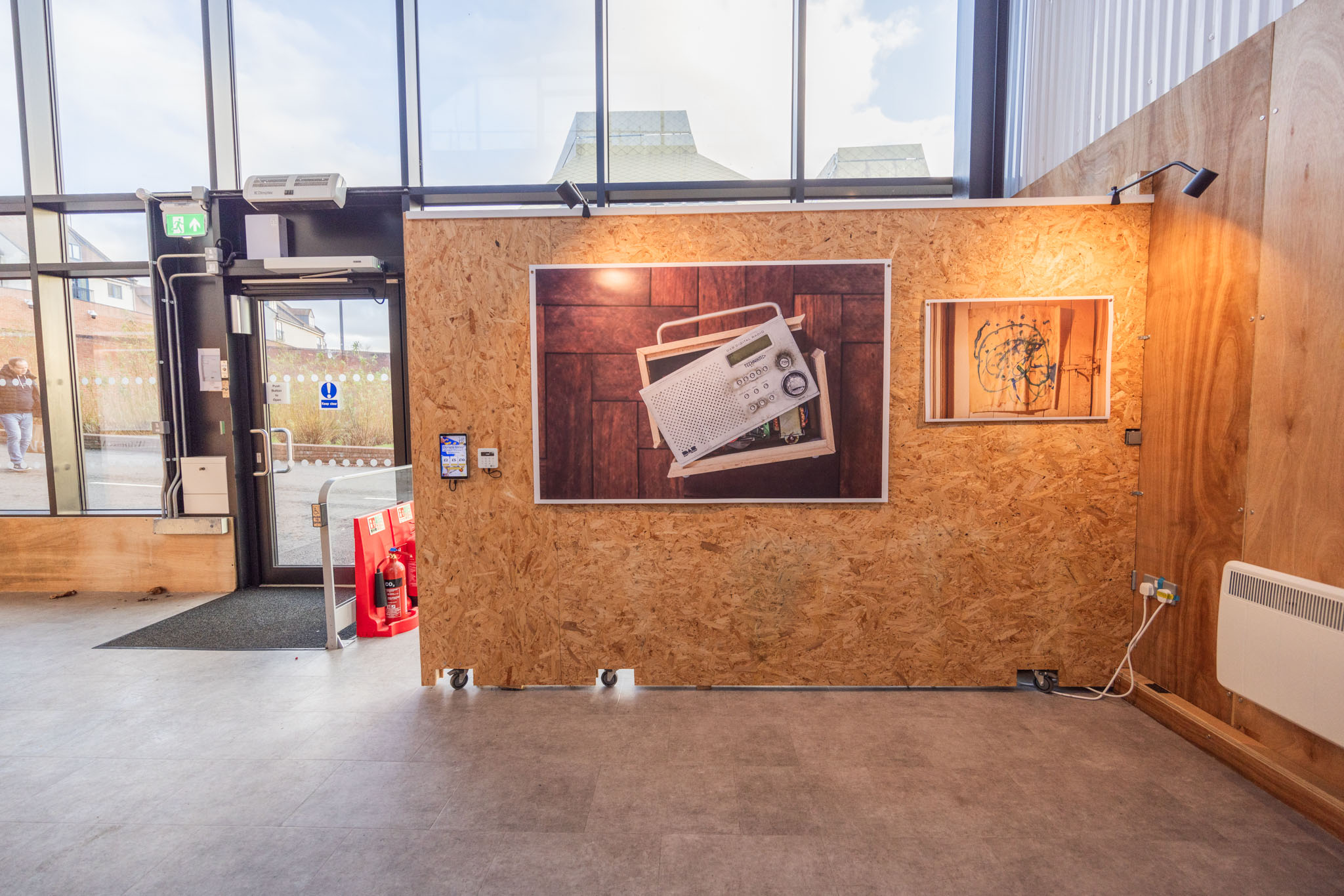
A recent visit to the printers for the final sign-off did not initially go well. They were struggling to get the quality that they’d been able to achieve earlier in the year.
I’d gone over to their premises feeling paranoid that I wasn’t going to get as much detail as I wanted in the shadows after viewing the finished books from Blurb with some consternation. The test images they showed me were showing significant speckling and a distinct lack of detail.
As the team had had another paper stock on the printer they’d done a test batch on that paper too. This was a decent mid-range photo paper, as opposed to the blue-back I’d been planning to use.
The pictures looked beautiful. The detail, the contrast, the colour depth, I was entranced…
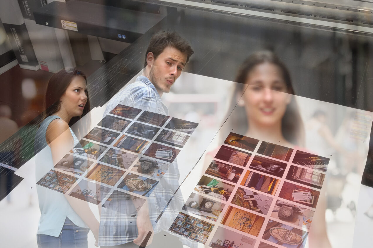
Even in the snapshot below you can see the difference – I was struck by how my deeper and nicer the colours were, and the greater detail to the extent that I was left in a quandary.
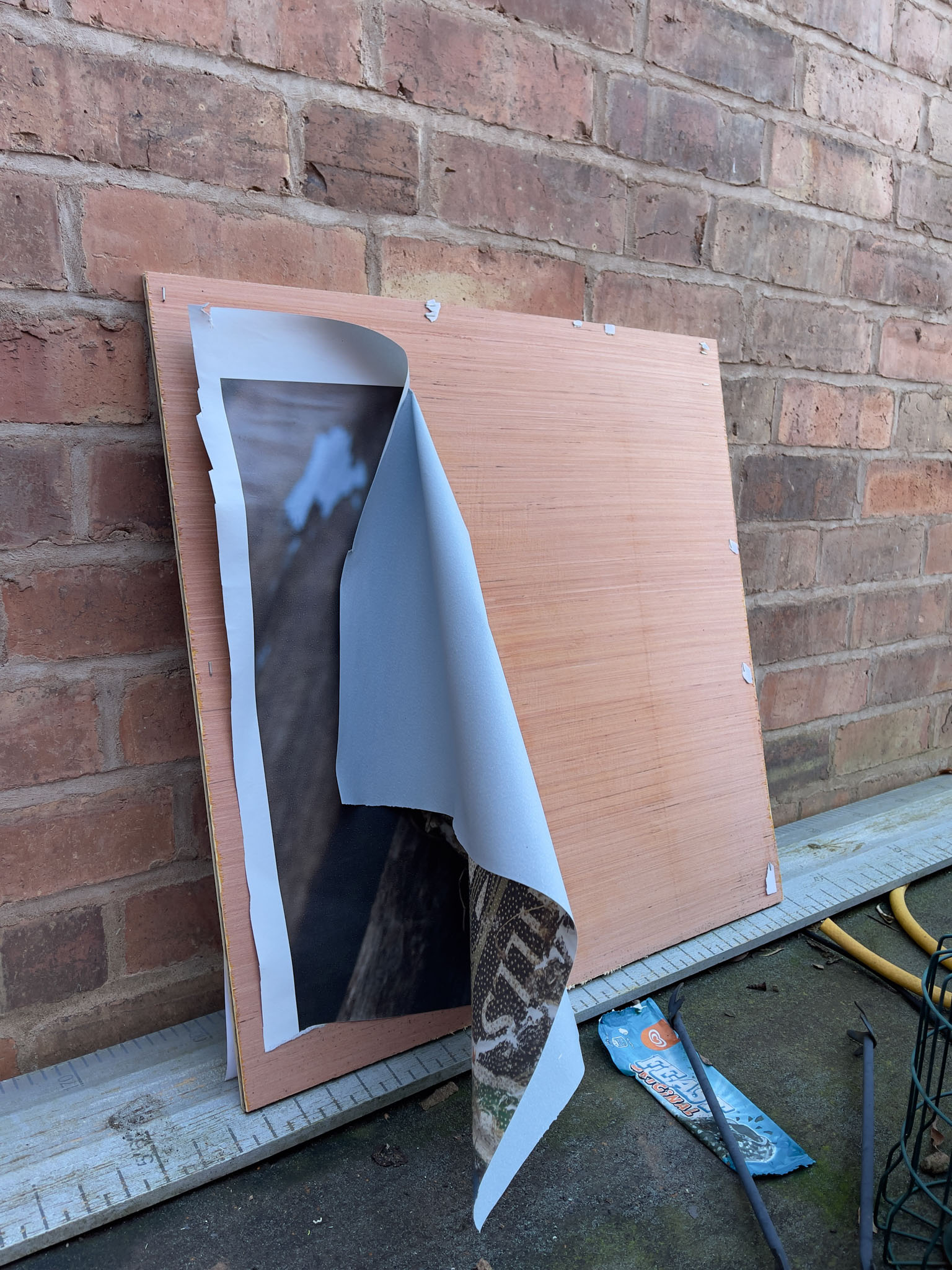
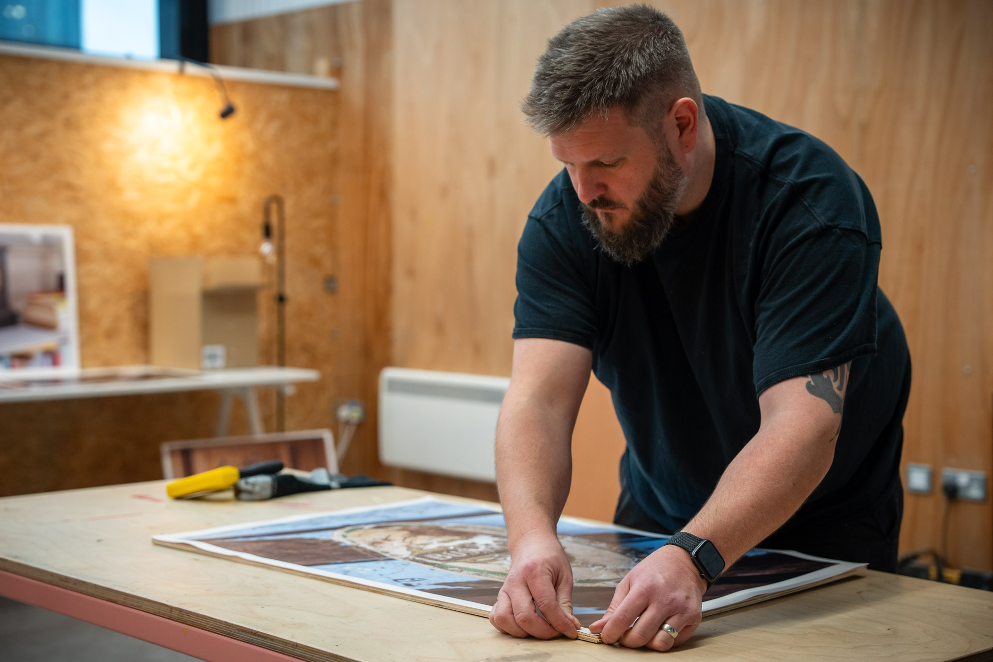
I brought the paper home and ran a test on it, trying to paste it my test plywood. It would not take the paste, and kept curling back at the edge. I was now having freaking out more than a little.
That morning I’d been over to Stourport where I could get the plywood cut to size for the exhibition.
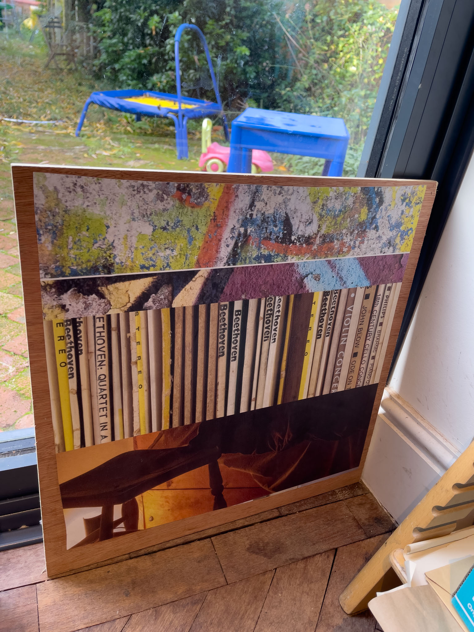
Realising what a challenge it was going to be to get the pasted pictures onto the boards I’d done a few tests pasting the board and putting the dry blue-back paper onto the board, with little success.
(The pictures were on the board, but they were damp, wrinkly, and in no way suitable to for an exhibition.)
I was suddenly aware of how challenging it was to mount wet prints on plywood, and then to do so and not get paste on the front, this had thus far been a problem for next month, or next week. It was now a problem for now and I was starting to panic…
I now had a boot full of plywood, enough wallpaper paste to redo my entire house and a choice of good prints that wouldn’t stick, or ugly ones that would.
Going back on Blue-back
The fly-posting idea has been really useful. Knowing how I would mount the images has meant that I haven’t had to worry about mounting them for the last few months, and that has left me free to make decisions about other things.
It is however time to acknowledge that as an idea it has proved costly. In terms of envisaged stress when it comes to mounting the images, and mostly in terms of image quality. The paper lends itself well to big bold graphics, but isn’t particularly good for photographs, and this is a photography exhibition. It wasn’t until I saw the images reproduced on photo paper that I realised how much image quality I was sacrificing.
For much of the last few notes the idea of wallpaper pasting the images has been a problem for later on, for further down the track. Over the last week, the test mounts have proved challenging. keeping the prints clear of paste and unwrinkled has been difficult but I’ve persisted because the actual paste-up was still a week away.
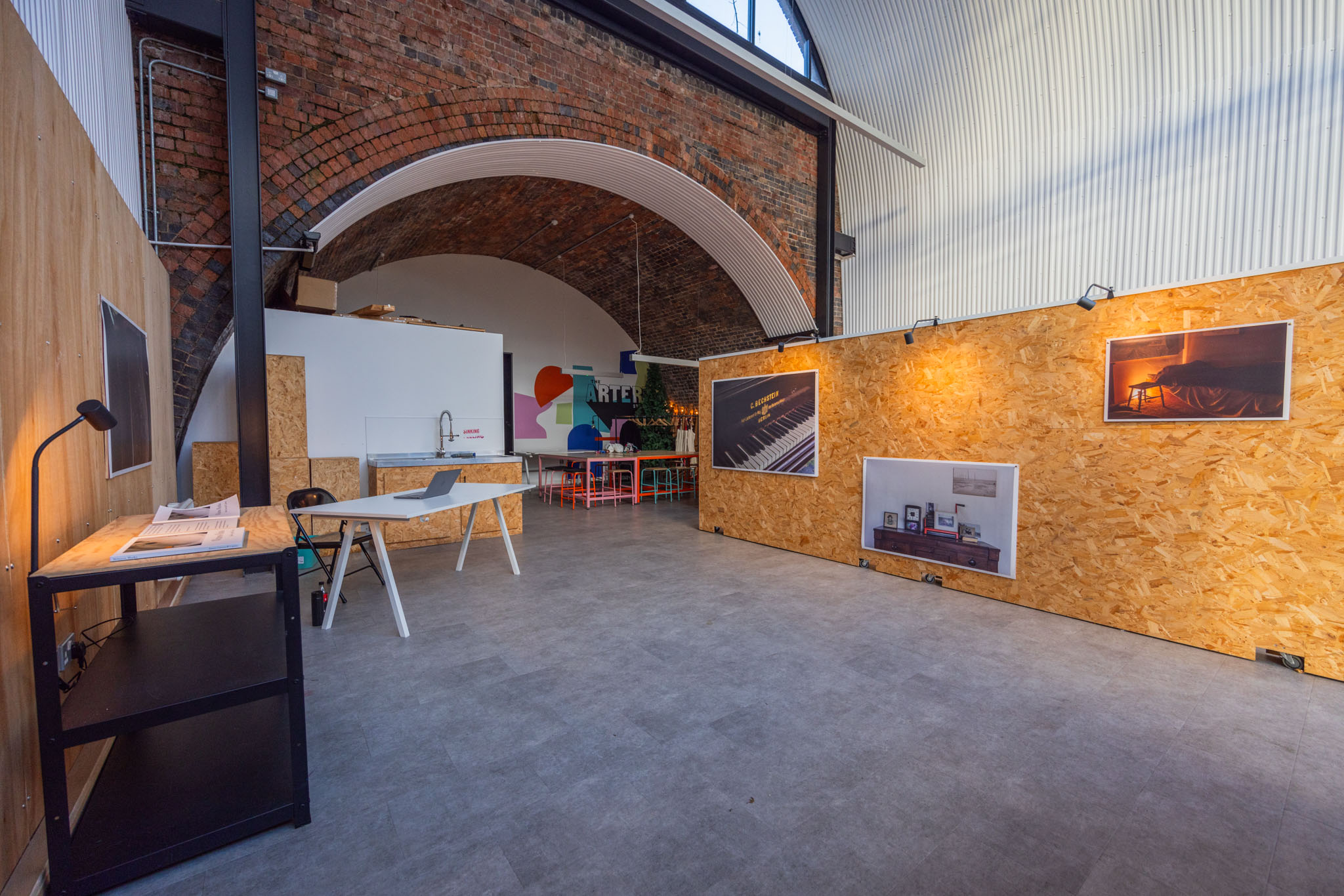
The fly-posting idea was essentially a way to do a lot of big prints cheaply, it meant that I could fill the gallery space in a deliberate way that paid homage to the space that I was infiltrating. They were to be a temporary witness mark, made on the surface of the gallery.
There are other ways to do this, that still nod in the direction of the temporary pop-up, with out the stress, mess and possible difficulties of fly-posting. I had originally considered bulldog clips, but Tony convinced me that this would look cheap and naff, (shit I think was the term). It also doesn’t reference the space particularly.
I’ve made the late term decision to staple the images up. Stapling gets used for missing pet posters, for notice boards, and for other temporary posters all the time. There is no way to remove the posters without ripping them, the sit outside much as fly-posted graphics do and they weather as these posters do too.
This provides me with a clean, quick way to mount these pictures to the plywood, embodies the temporary nature of the work and the exhibition and enables me to use the better paper and thus keep the improved image quality.
By the time the exhibition is over it will have cost me around £1800. I’m inviting friends, family and clients to this event, as well as the public. This is an opportunity to marry two sides of my practice together, the considered and hopefully artful approach to the creation of work, and my more commercial work, (which is artful, but perhaps in a different way). The fact that I’m presenting this work to a group who either already do, or might use me commercially in the future, makes me want to extract as much value from that investment as possible.
In short, I don’t want people to be wondering why the work doesn’t look it’s best, or worse to find myself explaining the reasons for my mounting decisions over the run of the exhibition. I don’t want people to look at the work and think that it is bad for a reason that they don’t understand.
I’m glad I had the fly-posting idea to use as a lynch pin throughout my prep for this exhibition. knowing what I would do later helped me form ideas in other areas without having to worry about print cost and space and framing and so forth.
It isn’t the best way to showcase this work.
Hopefully the use of the staple-mounting will be a valid way to do both, present the work in an apt and high quality way, and pay homage to the space in which it is exhibited.
(The images above includes portions of the Distracted Boyfriend image created by Antonio Guillem in 2015. This was a stock image that then went viral as a meme. It is used here without permission, in the context in which it became famous.)